* freelance commission working on behalf of Defyn
Women in MedTech Summit
Defining a vibrant sub-brand within an established portfolio
project type
branding & deliverables
year
2026
The brief
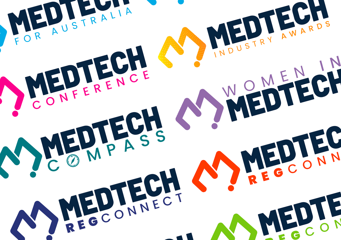
MTAA runs multiple summits and awards, each with its own sub-brand. For a new Women’s Health MedTech Summit, they needed an identity that felt distinct, while still clearly belonging to the MTAA family.
The brief allowed freedom across colour, typography and visual style, with one key constraint: the existing MTAA ‘M’ logo needed to remain for brand continuity.
project scope
Design System, Colour Palette, Typography, Social Assets, Website Assets
timeline
2 months

The challenge was to create a memorable sub-brand that stands out in the med-tech landscape, without breaking consistency across MTAA’s wider brand ecosystem.
My approach
I kept the existing MTAA ‘M’ to anchor the brand, then built a fresh visual language around it.
This included a bold colour palette, clear typography, and graphic imagery designed to feel energetic and modern.
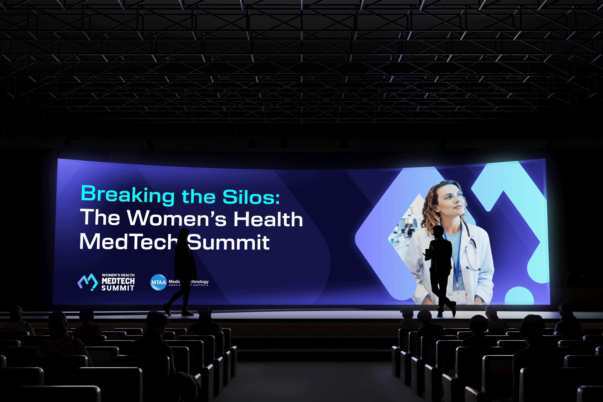
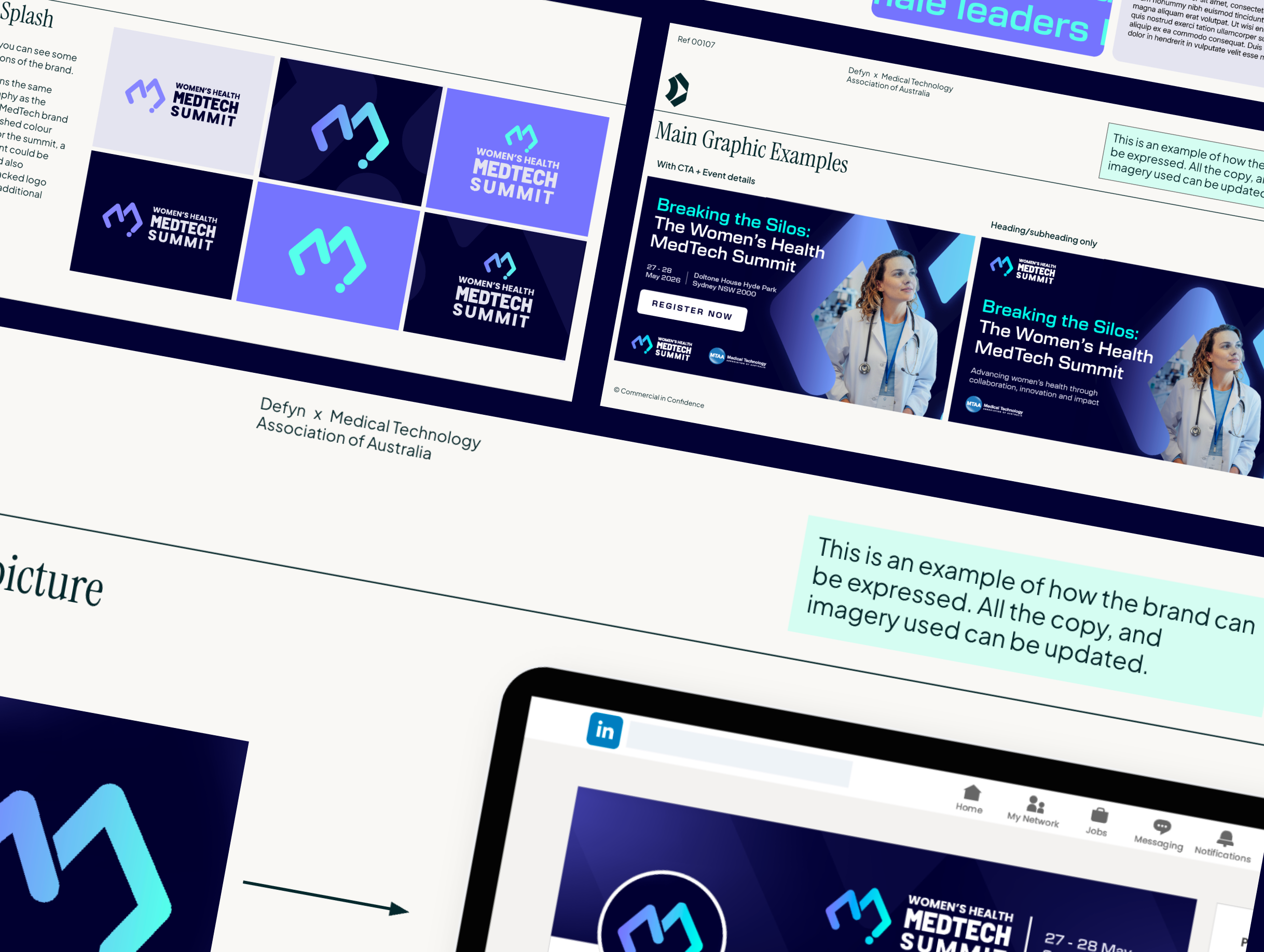
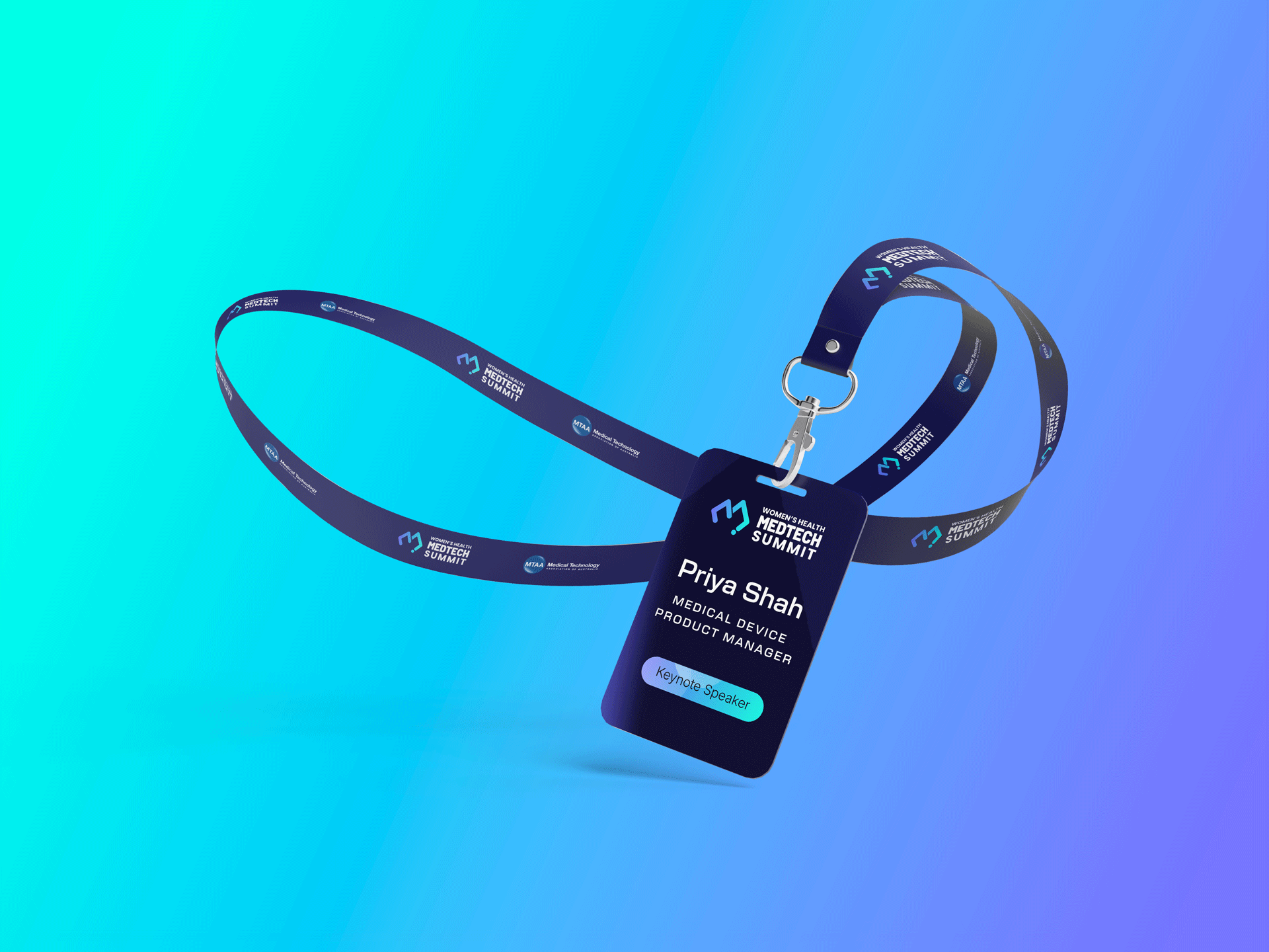
Throughout the process, the brand was presented in context of realistic mock-ups and layouts, so the client can easily imagine this brand working in the real world.
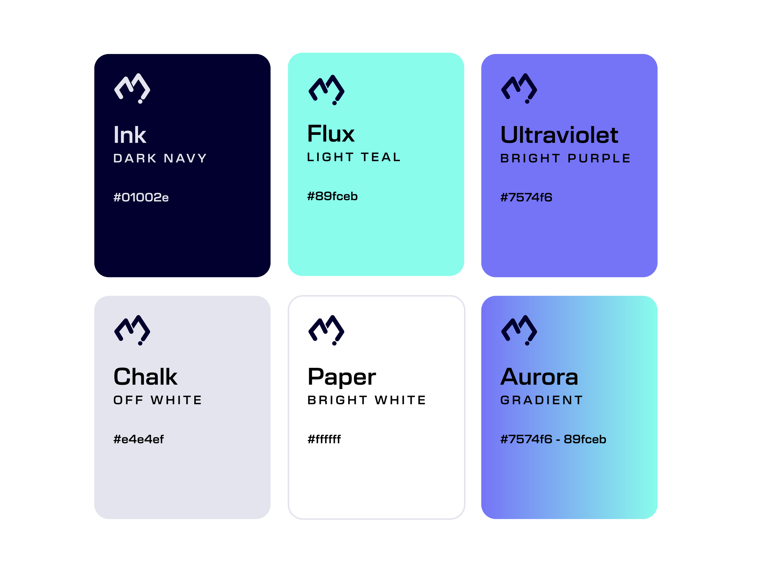
A vivid colour palette & simple systems
The colours were chosen to be vivid and punchy. They are professional enough for the industry, nodding to the visual language around MedTech, but are expressive rather than a safe muted option.
To ensure consistency, I focused on creating a clear, simple system of when to use each of the colours, rather than extensive guidelines. Due to limited budgets, this was provided to the client via rigid templates, rather than the client interpreting brand guidelines.
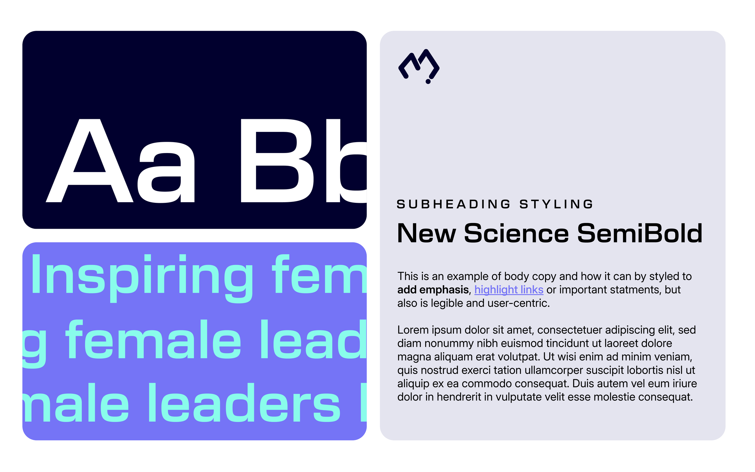
New Science Semibold is used for headings.
It’s highly legible at scale, with clean letterforms that suit technical and informational content. Subtle details, such as the deeper inkwells, add character and warmth, helping the brand feel human and confident without becoming decorative or distracting.
Rollout & Execution
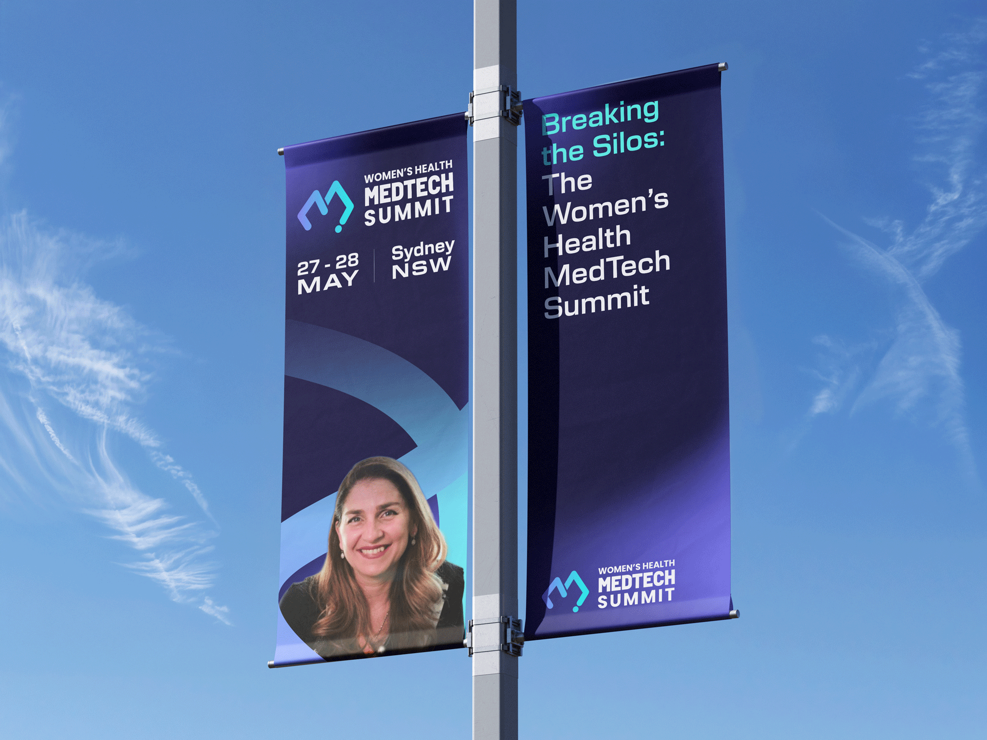
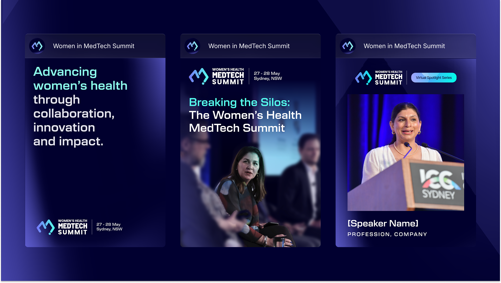
The identity was applied across multiple touchpoints, including:
Event agenda and signage
Email newsletters
Social media assets & press releases
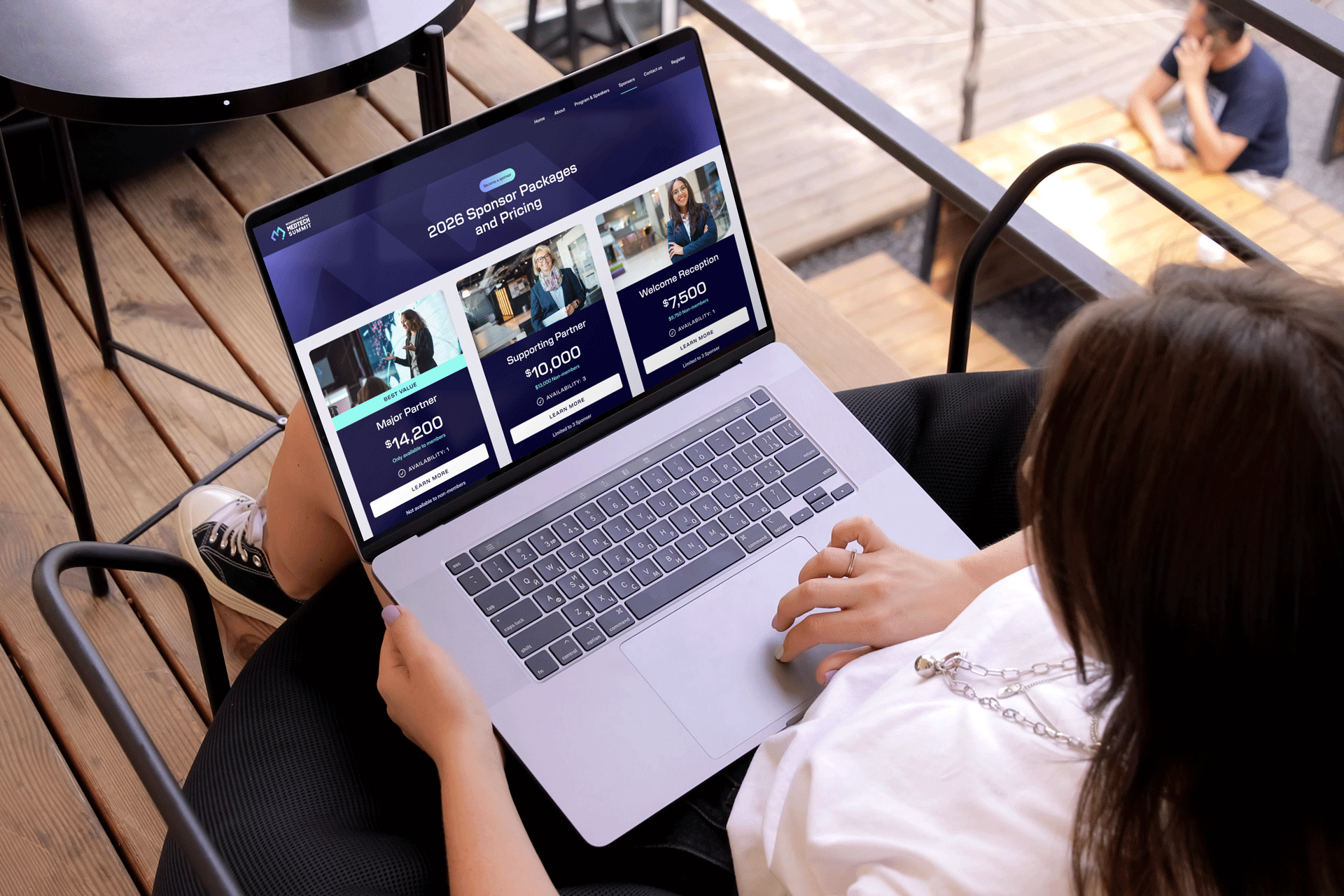
A reskinned event website
A reduced budget meant there wasn’t scope for full brand guidelines, the solution leaned on structured templates and a clear visual system to maintain consistency.
I created reusable templates in both Illustrator and Canva, giving the client flexibility, whilst keeping the brand execution consistent. A lightweight design system in Figma helped reskin the website with the new colours, headings and UI elements.
The result was a distinctive, scalable sub-brand that feels cohesive alongside MTAA’s existing events and is practical for the client to manage independently.