* freelance commission
Zak Stevens Talent
Crafting a brand and identity that communicates the bespoke nature of a specialist recruitment service
project type
branding
year
2026
The problem
As a new start-up entering a market dominated by established brands, the client lacked a visual identity that could compete at the same level.
Without any existing brand recognition, the challenge was to create an identity that felt credible and professional from day one, while remaining distinctive enough to stand out, reassuring customers, without blending into the background.
project scope
Tone of voice, Brand identity, Logo, visual system, Social Media Templates, Sales document
timeline
4-6 weeks with ongoing support after initial delivery
The challenge was to create an identity that felt credible and professional from day one.
Reassuring customers without blending into the background.
Defining a message that communicates a quality service
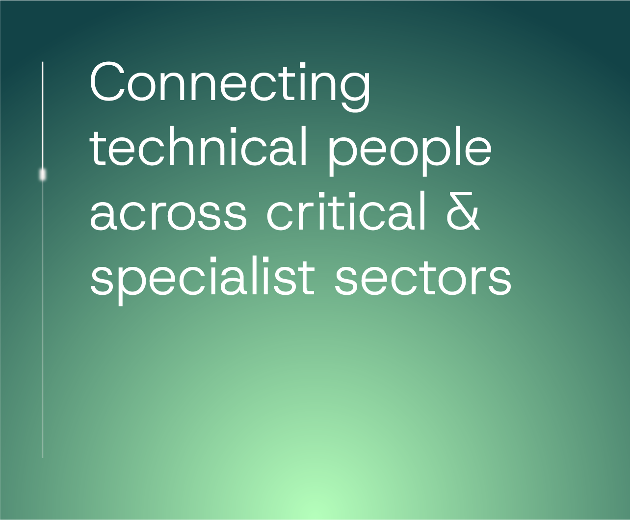
The brand is positioned as a specialist partner, combining years of industry knowledge with a personal, bespoke service.
By prioritising quality and expertise, the brand aims to make clients feel supported, all while delivering carefully matched talent through a considered, reliable process.
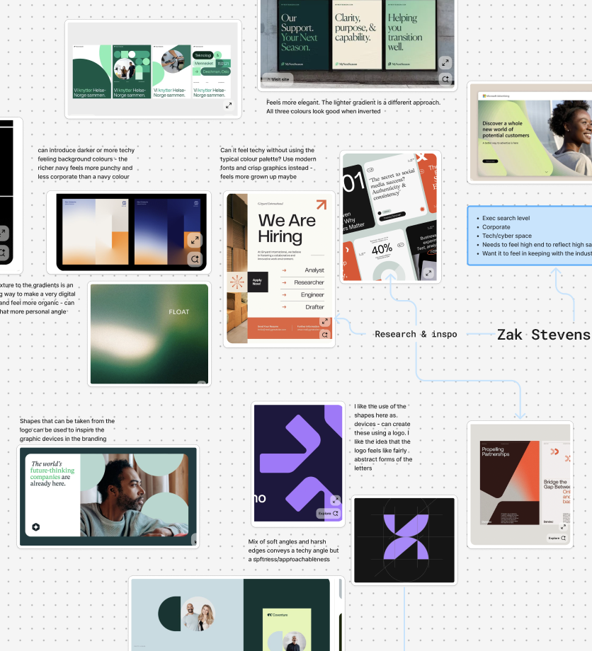
Understanding an established market & standing out in it
The market is dominated by established recruitment brands with strong reputations and recognisable identities. As a new business, the challenge was to confidently sit alongside these competitors, clearly communicating the expertise and quality, all whilst having a distinct visual style.
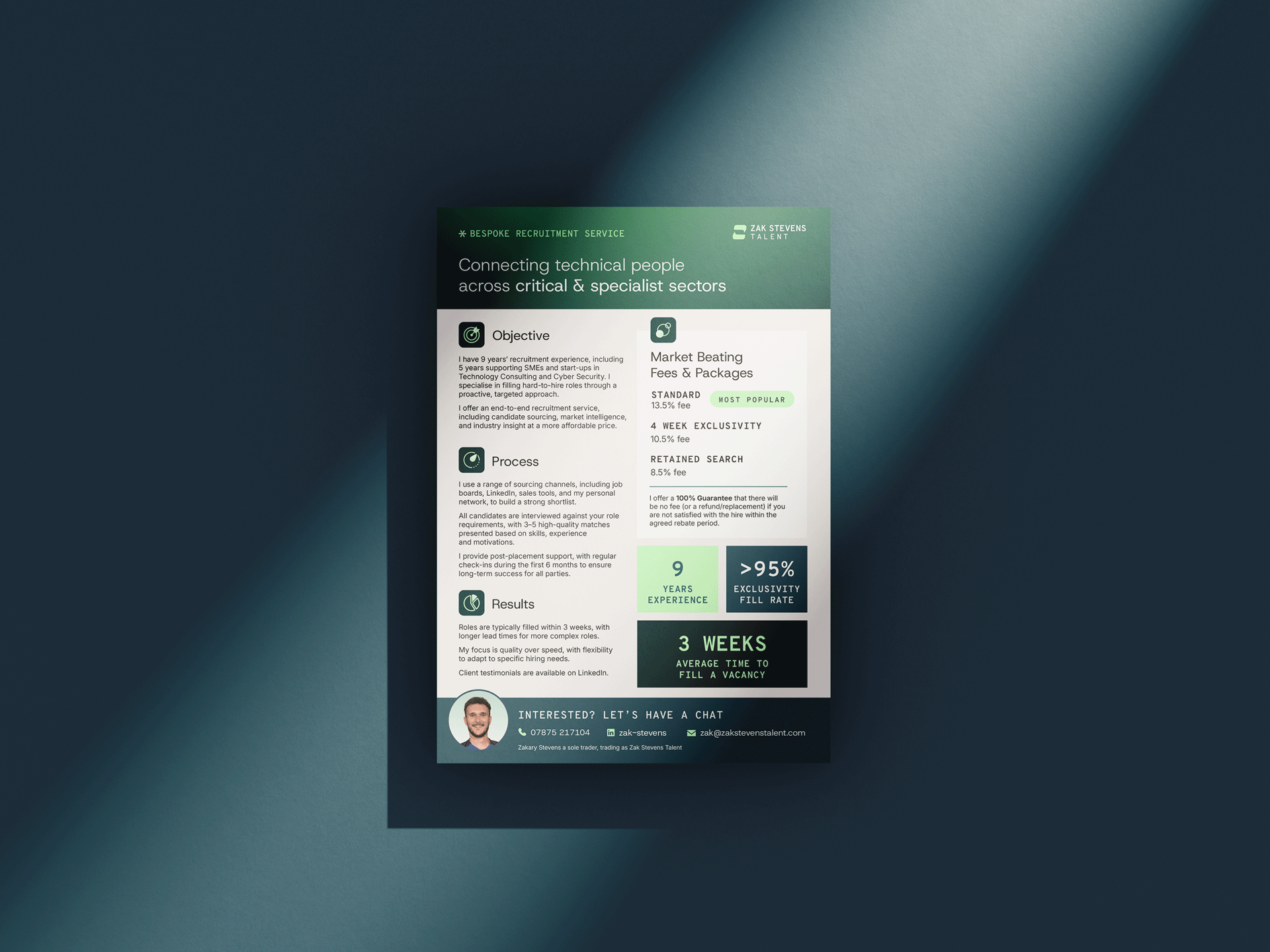
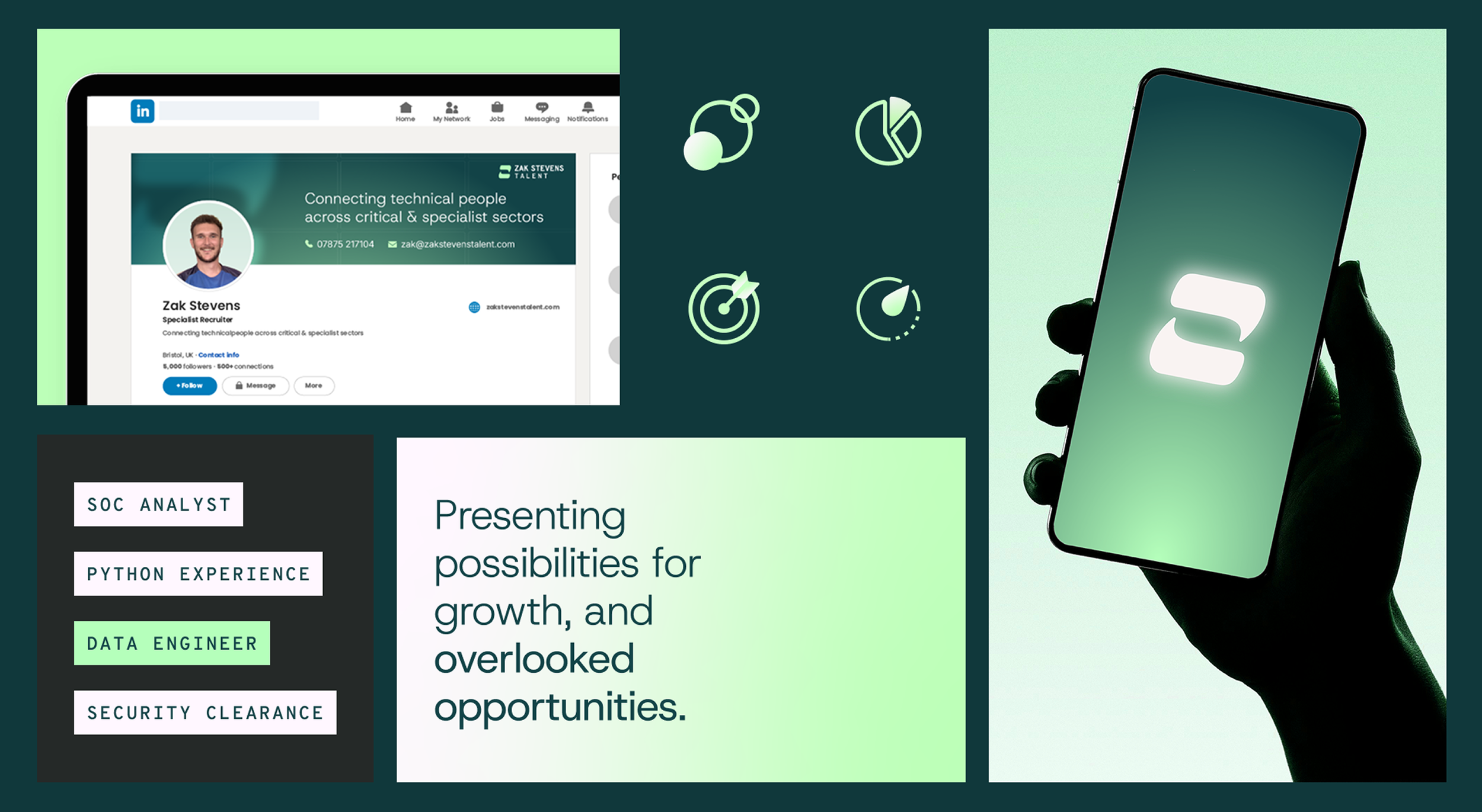
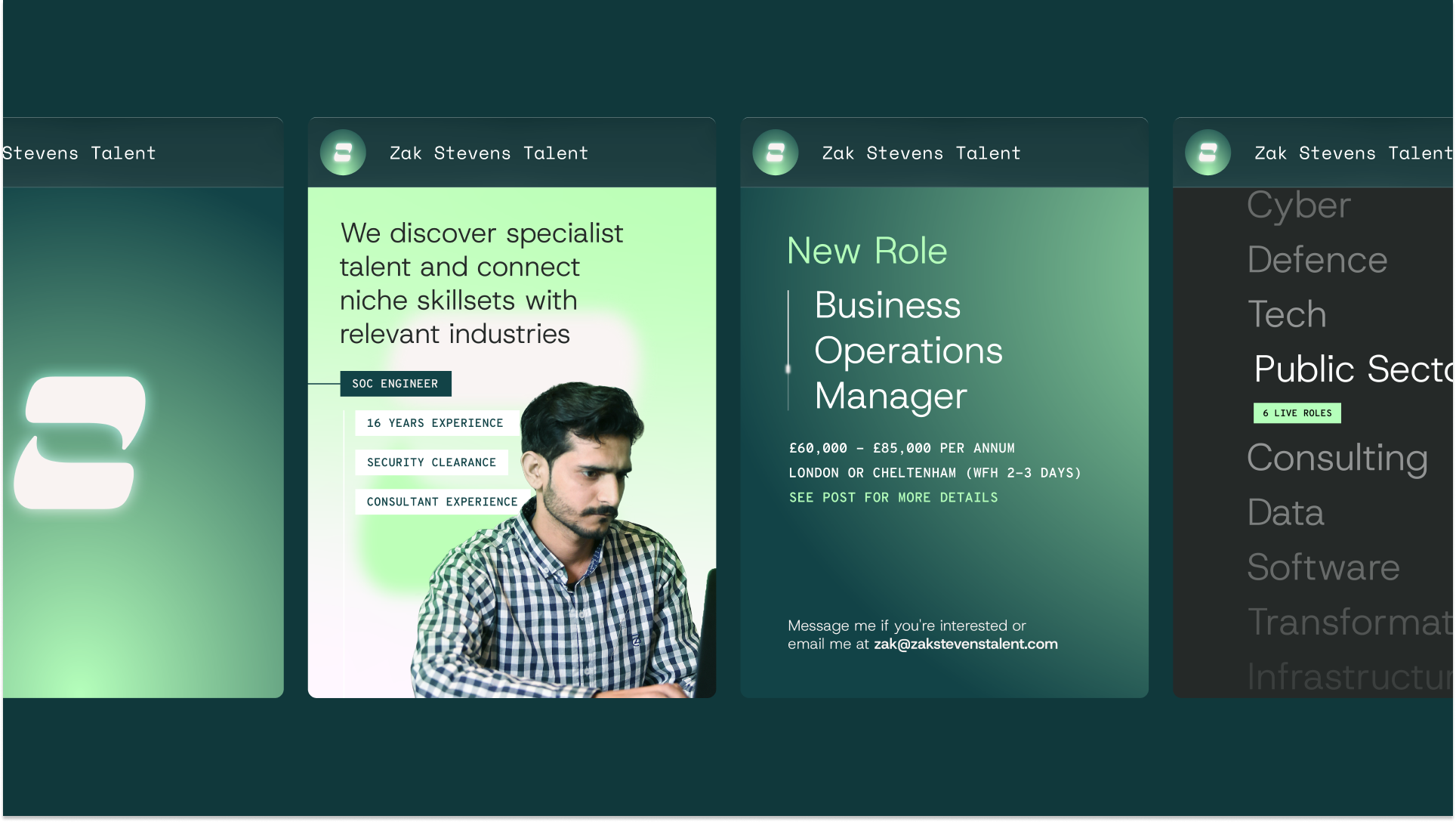
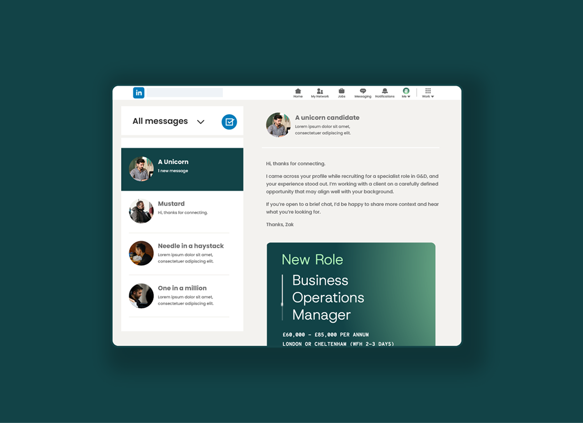
I developed a brand that communicated their premium offering through consistent visuals and clear, straightforward language. I provided the tools to consistently apply the brand across multiple channels, to candidates and clients alike.
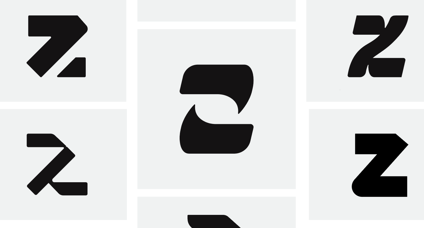
An informed creative direction
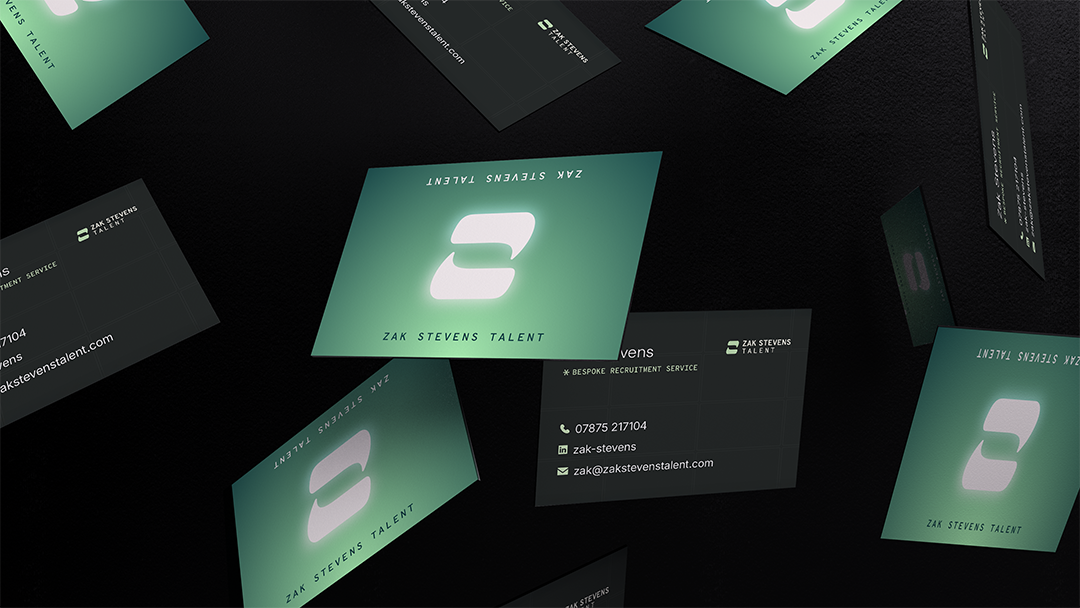
The logo concept centres on clarity and communication, taking inspiration from the conversations that underpin a successful recruitment process, and reinforce the personal, curated approach taken to each candidate and client.
Precise layouts, confident colours and clear typography
Clean typography, restrained colour use, and an ordered layout system were used to communicate professionalism and expertise. The visual system avoids unnecessary complexity, reinforcing a sense of confidence and reassurance rather than sales-led urgency.
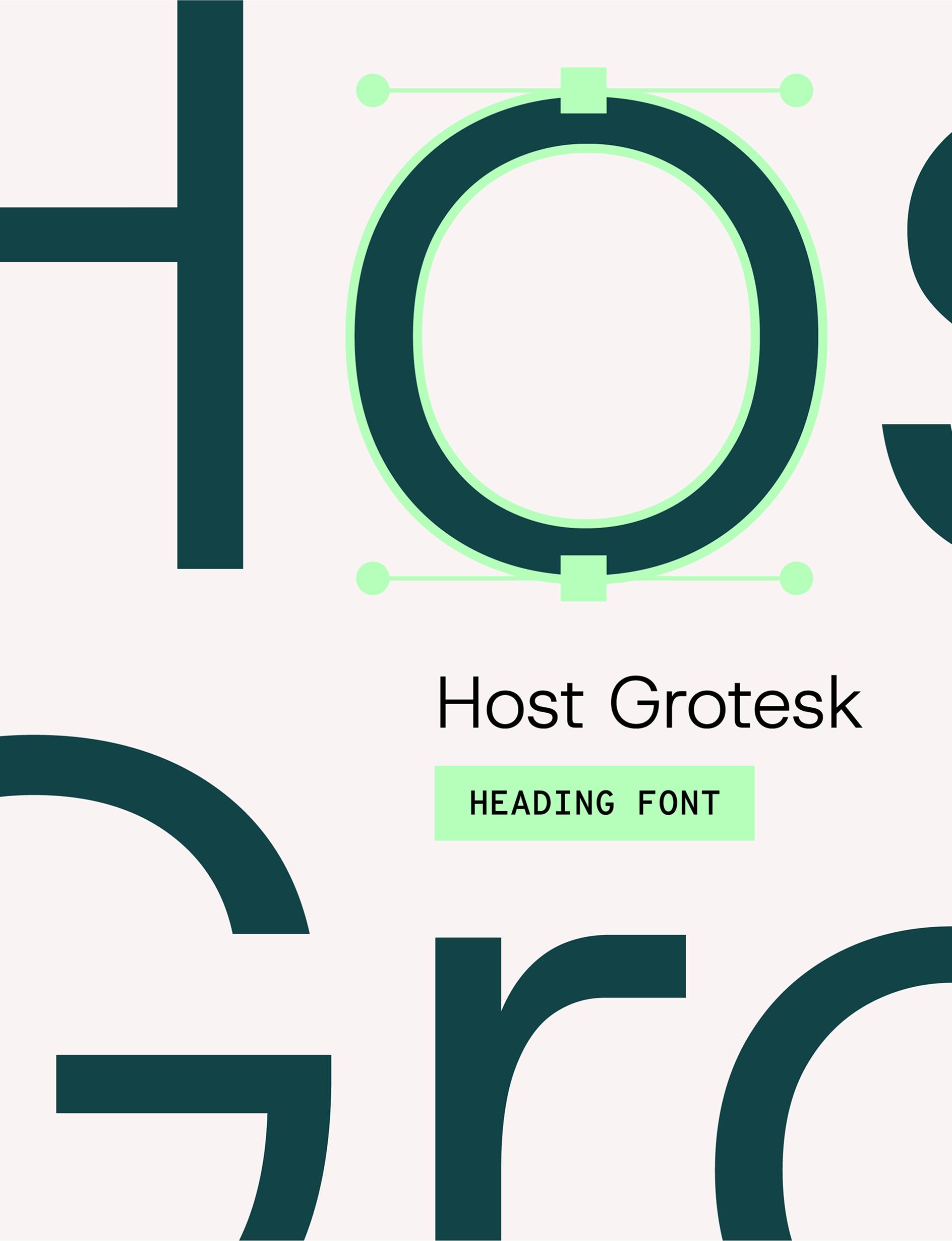
By adding subtle nods to the tech industry, such as a monospaced accent font inspired by the visual language of code, it feels distinctive without sacrificing credibility and maintains a personality.
The new identity provided the client with a confident foundation for launch, enabling them to present themselves as credible and professional from day one.